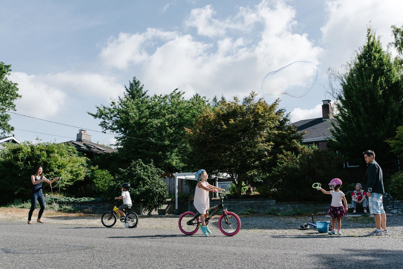
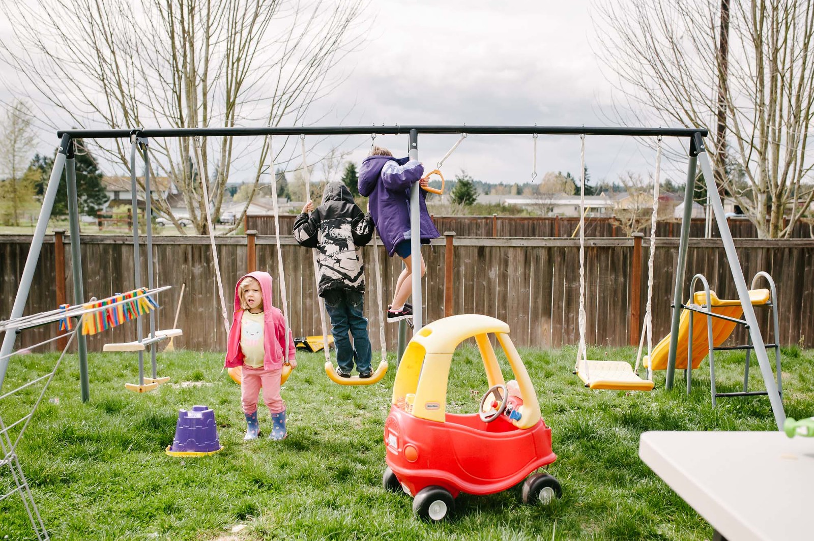
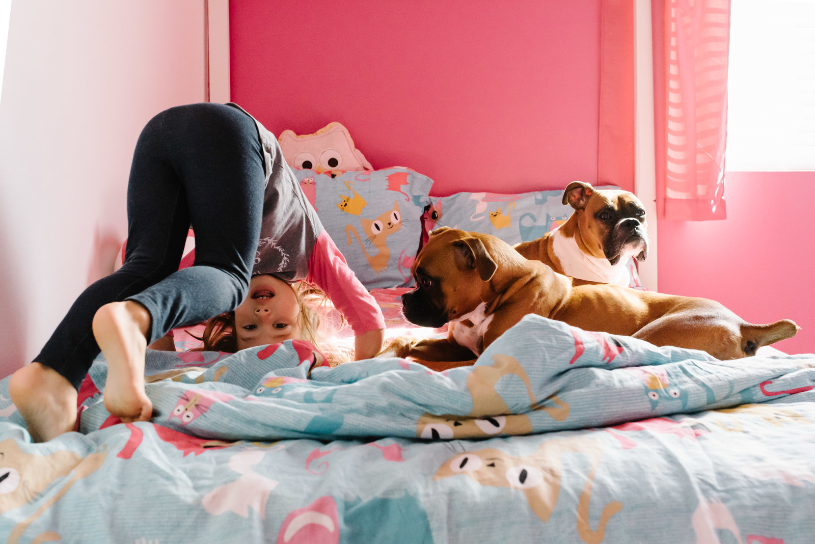
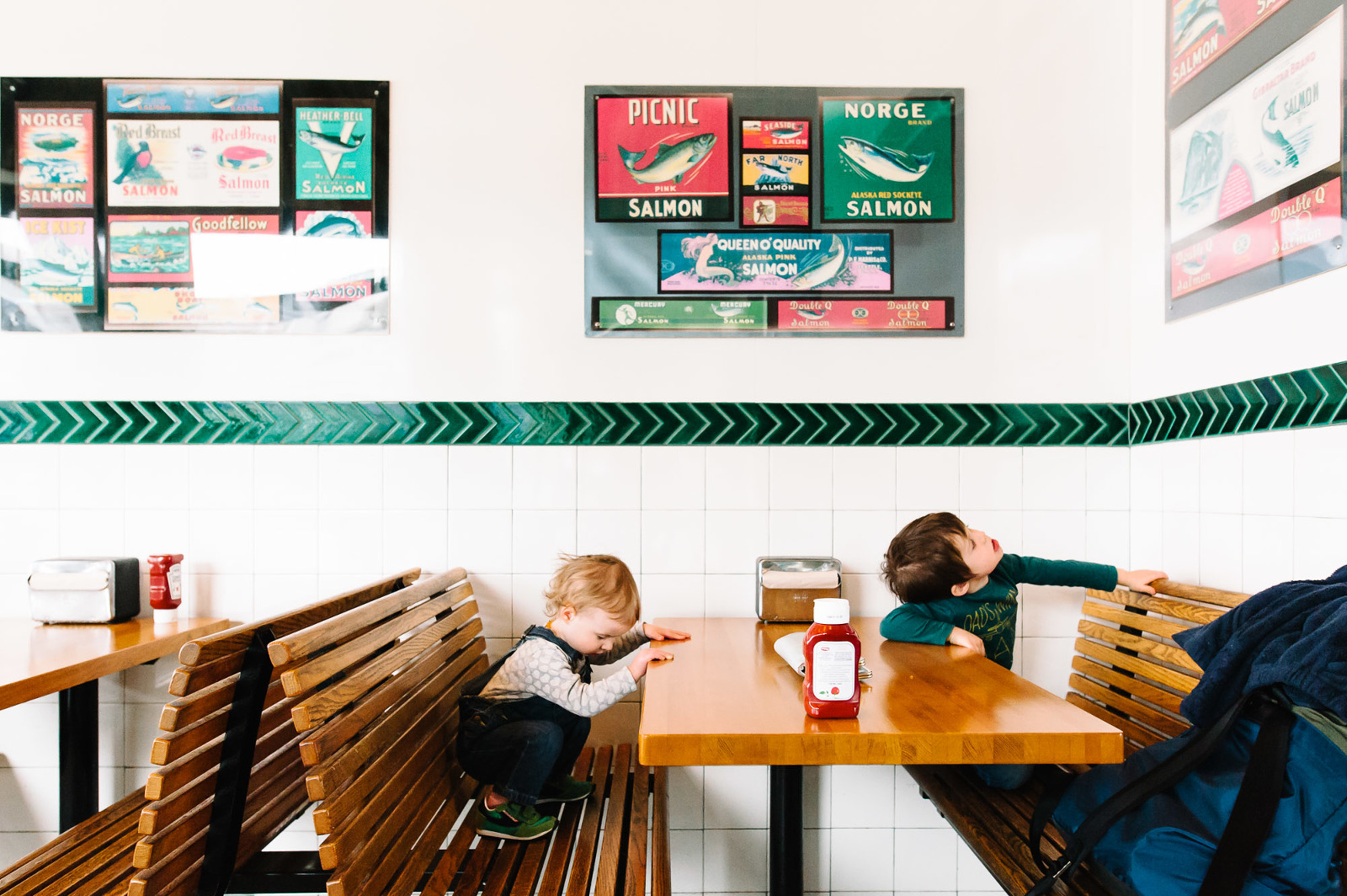
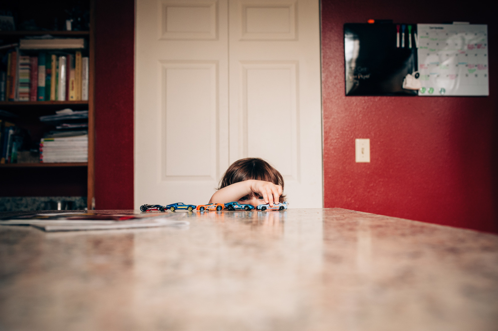
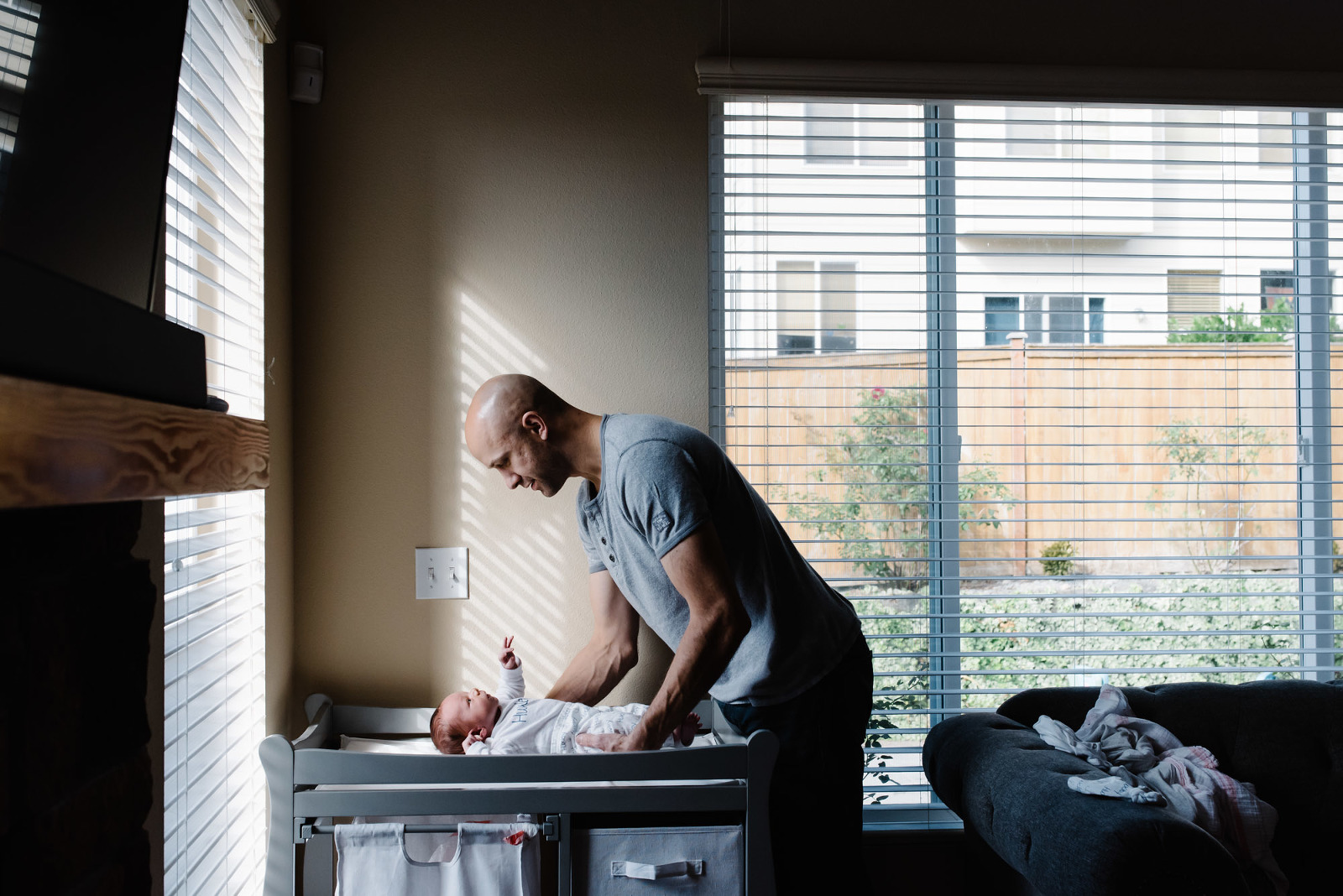
Week 37 was about experimenting with balance and tension in an image.
Conventional wisdom says you avoid putting your subject in the center of the frame because that creates a very static image. (Granted, this is an artistic pursuit where rules can and often are broken successfully.) Whereas placing an object on a thirds line and leaving some negative space almost always creates an image that is balanced but is dynamic. The negative space acts as an element to balance the subject which has much more visual mass which draws your eye, making the image both balanced and dynamic at the same time.
Personally, I love dynamic images with lots of negative space. When I review my personal portfolio I find a lot of my favorite images use the rule of thirds (or more where subjects are shoved into a corner of the frame). So for this exercise I wanted to challenge myself and create something that was balanced but a little more static.
In the following image I have elements placed, more or less, on both third lines. While the building is much larger than the truck, the color of the truck lends it a greater visual mass so I keep finding my eyes going back and forth between the two. Because of that it’s not particularly the greatest image, but illustrates balance, tension and visual mass quite well.
.jpg)
